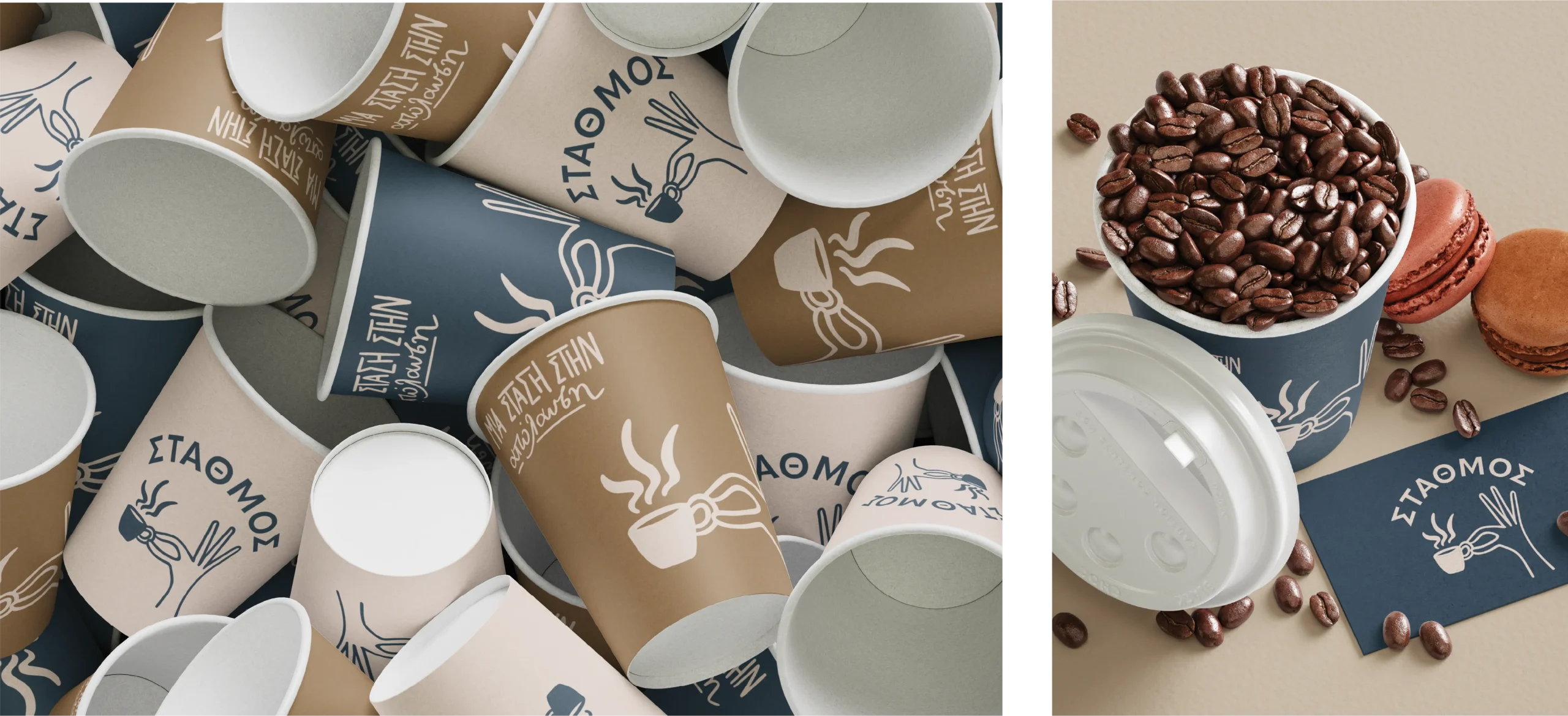
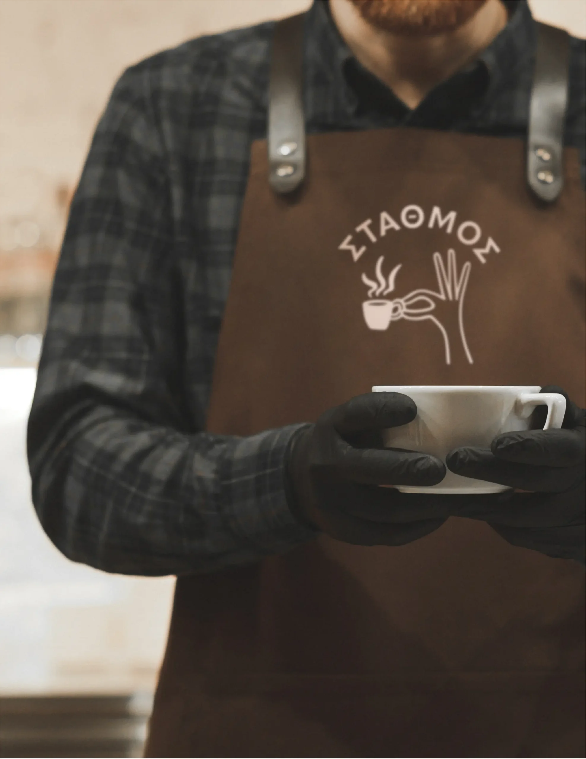
The Station is more than just a cafeteria. It is a meeting point, a daily stop for coffee, conversation and relaxation.
The rebranding aimed to convey exactly this feeling — of intimacy, energy, and human contact.
#466475CMYK 77, 53, 40, 16RGB 70,1 00, 117
#8e735aCMYK 41, 50, 65, 15RGB 142, 115, 90
#e1cfc4CMYK 11, 17, 19, 0RGB 225, 207, 196
The new identity was based on the concept of the “station” as a place of intersection of moments and people.
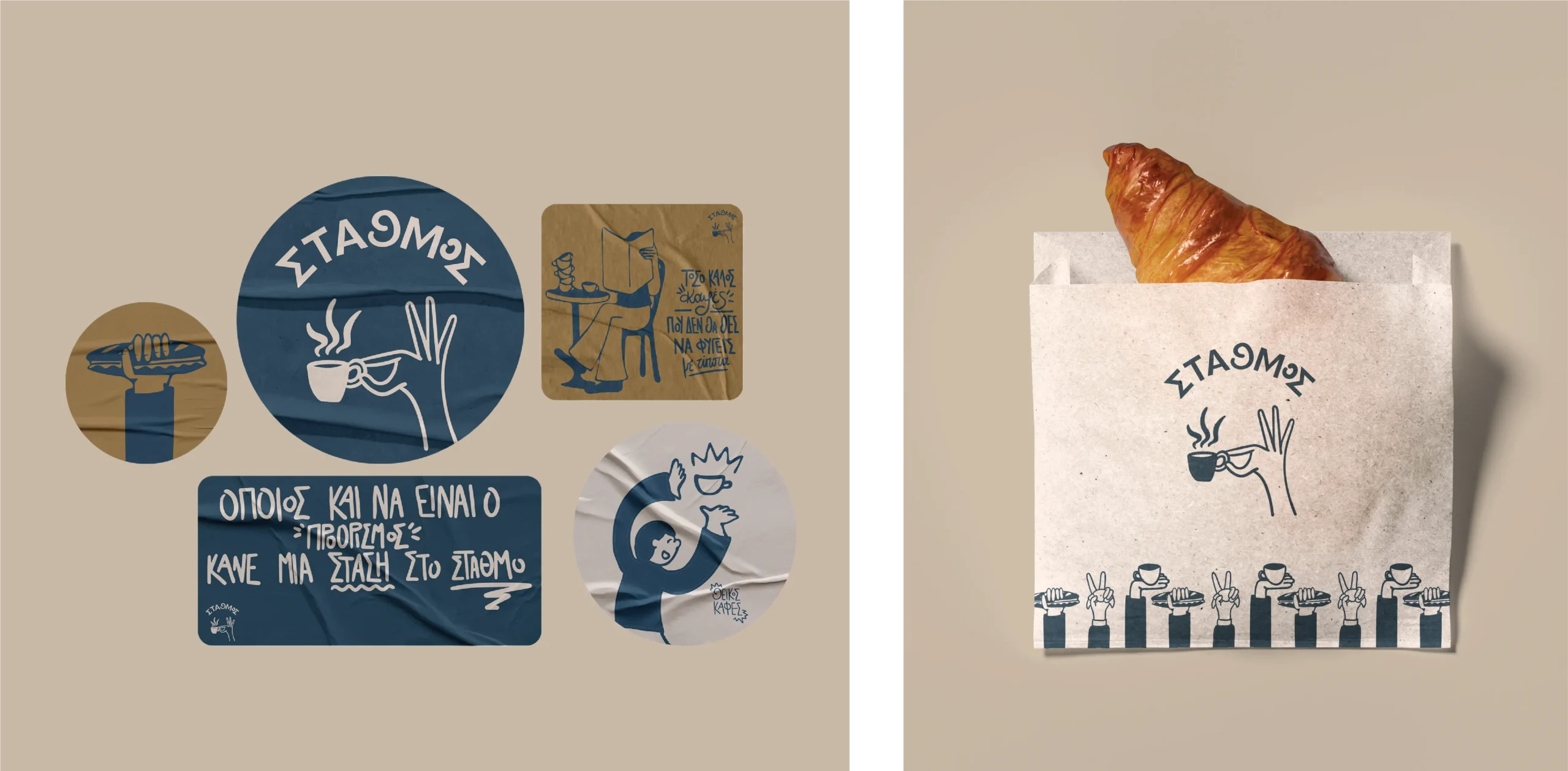
The visual language combines the warmth of the handmade with a fresh, illustrated aesthetic that reflects the rhythm of everyday life.
The illustrations play a central role — lively, playful, with references to coffee culture and the small moments of the day.
Identity unfolds in every aspect of experience:
The new branding expresses with simplicity and freshness what the Station is:
a place where people meet, smile and take a break from the flow of their day.
An identity full of movement, character and positive energy.
Social
Menu